ORGANIZATION and PEOPLE LEADER using a DESIGN LENS to create UNFORGETTABLE EXPERIENCES, STREAMLINED PROCESSES, and IMPACTFUL BRANDS with measurable results.
Combines 15+ years of advertising and 10+ years of change management experience to create people-centric programs/products/brands.
Product & Campaigns
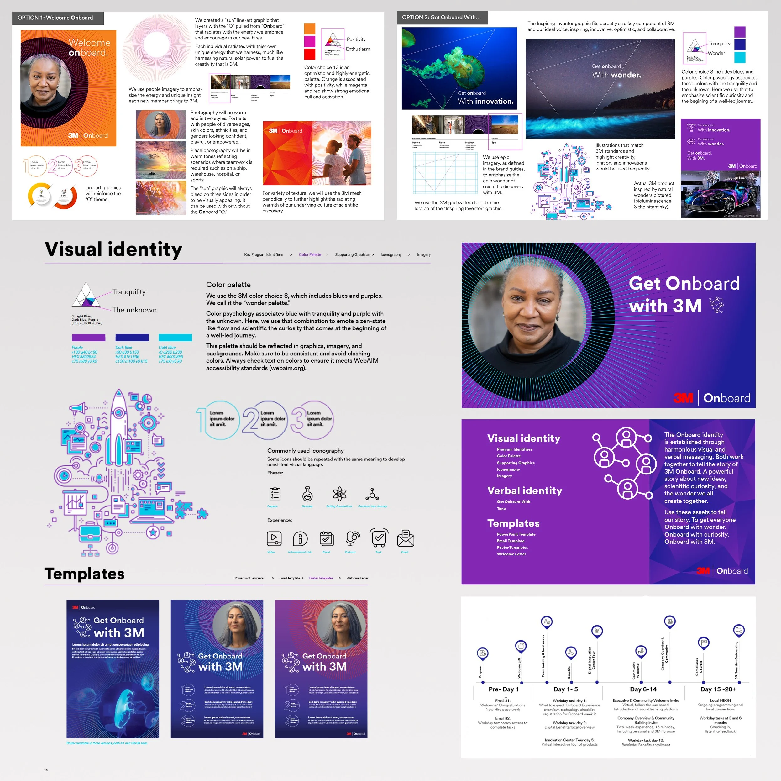
3M Onboard
Role: Brand development including narrative, key graphics, brand marks, hierarchy development, template design, journey map, client leadership, team development, campaign design, production
Challenge: Create a supporting brand and assets to complete the new-hire onboarding program for 3M. Campaign had to utilize overall company mission to excite, inform, and welcome new-hires.
Concept: Our verbal and visual identity work together to tell a powerful story about new ideas, scientific curiosity, and the wonder created together. To get everyone Onboard with wonder. Onboard with curiosity. Onboard with 3M. A sun line-art graphic layers with the “O” pulled from “Onboard” that radiates with the energy we embrace and encourage in our new hires. The sun graphic paired with diverse portraiture allows individuals to see themselves as the radiant energy that fuels the company. Onboarding materials included a journey map outlining the basic onboarding process for a grounding experience.
Deliverables: Logo, style guide, supporting graphics, welcome letter, journey map, templates (posters, PPT, email), iconography, swatch files, and imagery catalogue.
Theater
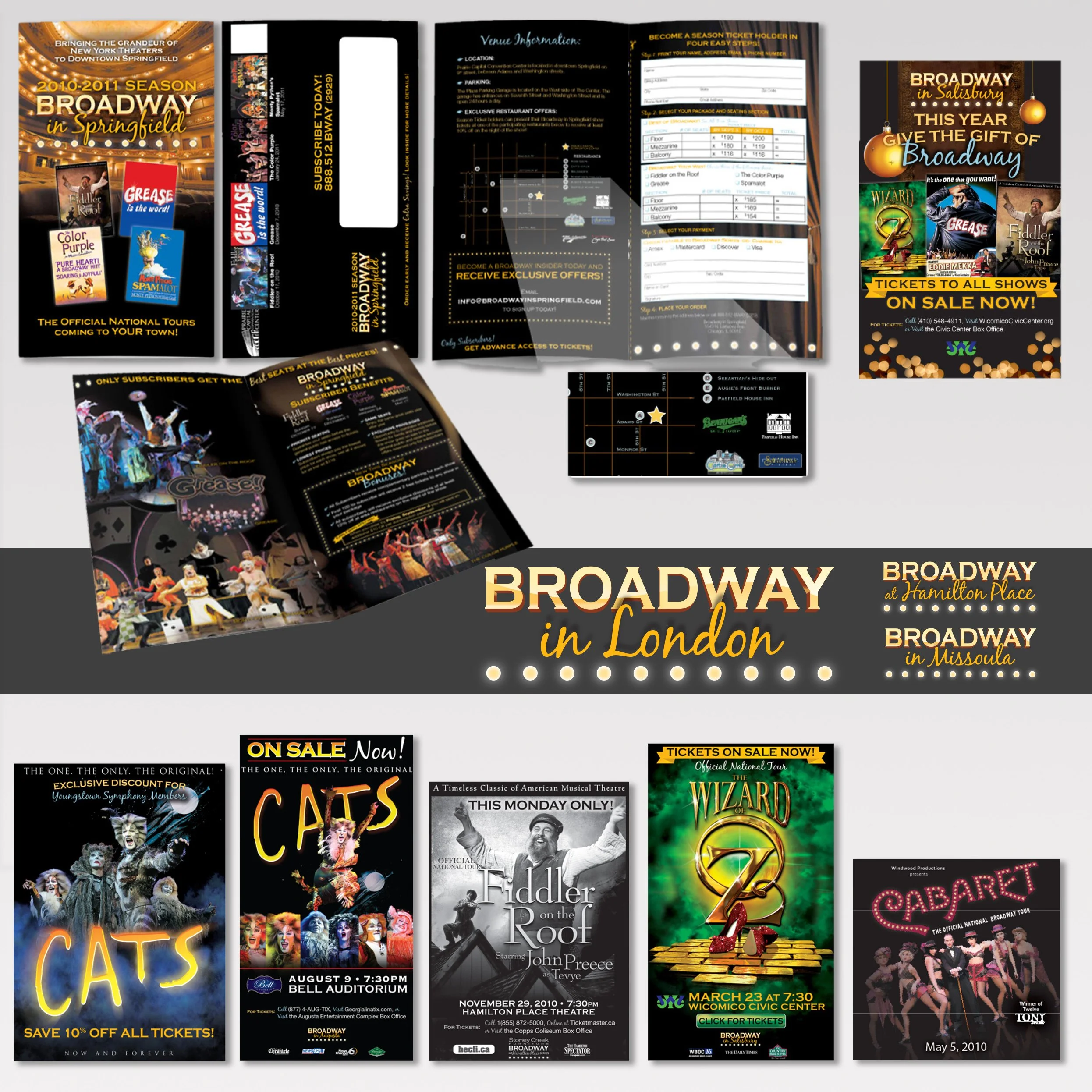
Role: Brand including logo, annual subscriber brochures, seasonal and show-specific ads for 10+ cities.
Challenge: Create brand and assets that can be easily localized for cites across the US and Europe. Keep up with scheduled and last-minute marketing opportunities for each city and show.
Concept: Capturing the drama of live theater with show lights, stark shadows, and building from black, I was able to create a visually striking yet easy to manipulate brand. Each city got its own logo, brochure with localization information, and mail-in forms. Then, as the year progressed each city and show had its own marketing campaigns based on either standard assets or assets I created for the show (Cabaret, Big Pants and Botox, Cuff Me). As sole designer for hundreds of shows over 5 years, project management, asset maintenance, and prompt billing were essential.
Deliverables: Dozens of brochures, hundreds of print and web ads, mailers, email marketing, taxi and billboard signage.
American Cancer Society
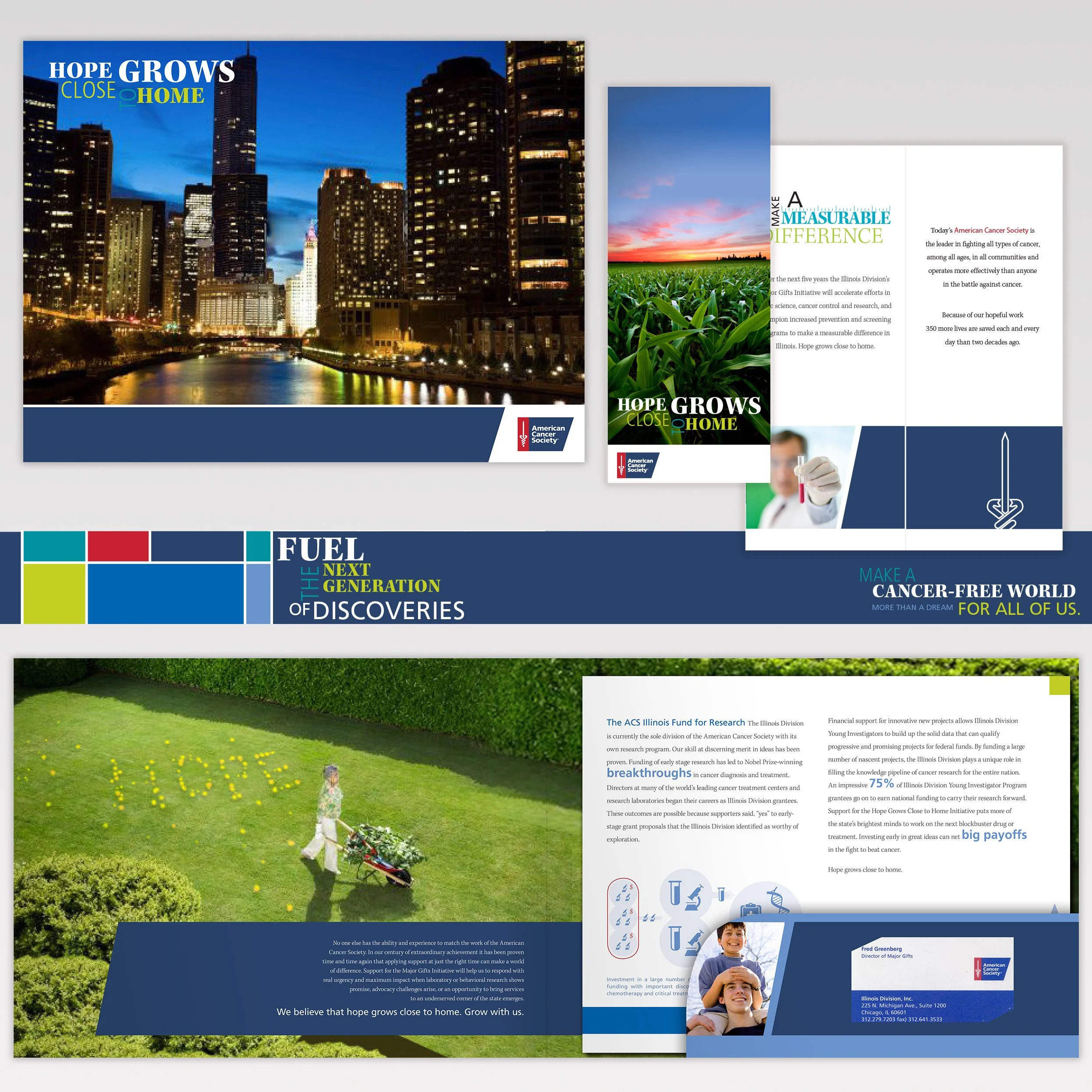
Role: Audience identification, touchpoint identification, campaign design, production
Challenge: To raise 25 million dollars over a seven-year period for research and development for the Illinois division of American Cancer Society. Campaign design included identification of likely donors, targeting of their top reasons for donation, and design prompts for each pipeline step.
Concept: Most donors were high-earning, high-education midwesterners who had been touched by cancer themselves. The tag, “Hope Grows Close to Home” was developed to combat the feeling of hopelessness a potential donor feels when faced with a cancer diagnosis. A variety of Illinois home-types are used with the verbiage “hope” lighting them, or blooming around them, allowing city, suburb, and rural families to see themselves in the imagery. Inserts for each folder could be swapped out to match individual concerns, budgets, or expected results.
Deliverables: Gate-fold brochure, folder, and 24 inserts with charts, program descriptions, and goals. Inserts are designed to be tailored to the recipient matching specific interests, pet projects or the target donation amount.
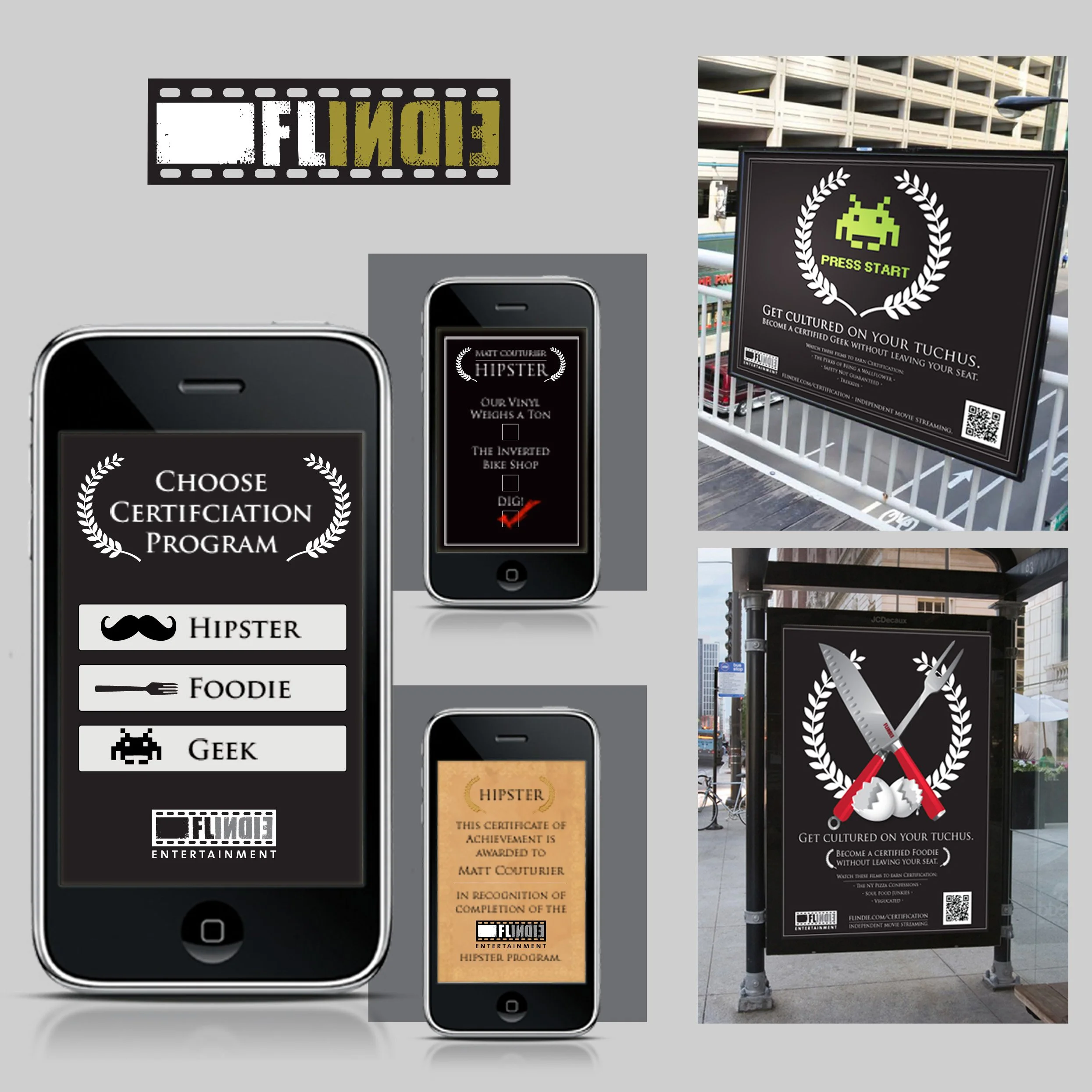
Flindie
Role: Launch strategy, brand design, campaign design, application design
Challenge: Launch an independent film streaming service.
Concept: The launch campaign recalls award graphics like the Sundance Film Festival to leverage brand equity in adjacent spaces. Key audience insights included that people like to feel smart. Creating a launch campaign focused around spare time on public transit, we were able to turn wasted commute time into quick certification time with short commute-length films that created habits around our platform.
Deliverables: Logo, launch campaign, ads, and micro-site.
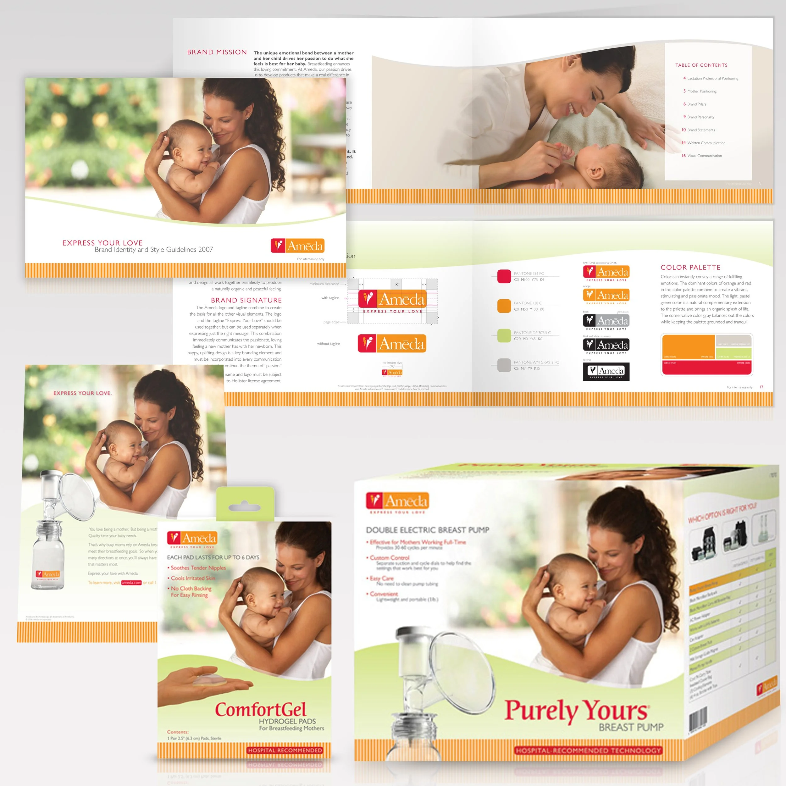
Ameda
Role: Brand voice development, design, production
Challenge: Re-brand international line of B2B breast pumps for a B2C market.
Concept: As the inventor of the modern breast pump and hospital standard, Ameda needed to enter the B2C market looking scientifically-focused rather than cute. The wave points to the adjustable cycle (of which Ameda is the inventor of). Imagery is feminine and nurturing without being sweet.
Deliverables: Logo, brand book, packaging (including die-lines), brochures, ads and photo re-touching.